Tag Archives: color wheel

Hues, Tints, Tones and Shades – What’s the Difference?

Who Creates Color TrendsLet’s face the facts: we can easily take color for granted. Even when we are enjoying the brilliant hues of nature and the masterful shades in paintings, it is hard to be fully aware of the colorful intricacies we are taking in.

Case in point: do you know the difference between hues, tints, tones and shades?

To some, it comes as a shock to learn that these colorful qualities make up multiple tiers of the color wheel.

Basic and Intricate Elements of the Color Wheel

At first glance, the color wheel is a tool that guides us in using primary, secondary and complementary colors. But it also does much more than this. It describes analogous colors (any three colors that sit side by side), split complementary colors (which considers the two colors adjacent to a complimentary hue), and tetradic colors (a group of four colors, made up of two complimentary colors).

Beyond defining aesthetic color combinations, the color wheel also offers a good starting point from which tints, tones and shades can be properly identified.

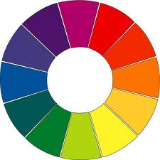
The color wheel at its most basic form is made up of 12 hues. Hues are pure colors. When white is added to hues, they lighten and become known as tints. When gray is added to hues, they dim and become known as tones. When black is added to hues, they darken and become shades.

This excellent image, compliments of lifehacker.com, shows the many levels of the color wheel:

Learn the Basics of Color Theory to Know What Looks Good

Using Hues, Tints, Tones and Shades

Different tiers of the color wheel come in handy when decorating, designing graphics, deciding on outfits or preparing works of art. For instance, matching a hue with its complementary shade can make for a dynamic combination. Sometimes, people find hues to be strong and bold. They may prefer light, more whimsical tints or are drawn to the calmer depths of shades.

More so, it can be nice to use one hue and its tints, shades and tones. This creates a monotone chromatic color scheme. In the same vein, a monotone achromatic color scheme uses all variations of neutral colors and can be brought to life with a brilliant hue.

Did you know the color wheel was so intricate? To learn more about the differences between hues, tints, tones and shades, as well as learn how to pick the best looking combinations for your wardrobe, home décors and art projects, check out this blog post: http://lifehacker.com/learn-the-basics-of-color-theory-to-know-what-looks-goo-1608972072.

There is so much to learn about the color wheel, but the most important thing to know is it won’t steer you wrong.

Read more Segmation blog posts about color theory:

Basic Color Theory – Color Matters

Color Theory Basics: The Color Wheel

How Well Do You Know The Color Wheel?

Be a Artist in 2 minutes with Segmation SegPlay® PC (see more details here)

Segmation

Join us on SegPlay® Mobile iTunes now available for iPhone and iPad

www.segmation.com

Basic Color Theory – Color Matters

Color Wheel

The world is filled with infinite shades of color, from a candy-apple-red sports car to a smoldering orange sunset to the crisp green of springtime grass. The popular color wheel simplifies the shades into 12 distinct colors to help illustrate the variations.

Arranged in a circle with 12 sections, the wheel presents a visual representation of the primary colors in the following order: blue, blue/green, green, yellow/green, yellow, yellow/orange, orange, red/orange, red, red/purple, purple, blue/purple. The colors are arranged in a chromatic sequence, with complementary shades opposite one another. These are all of the standalone colors that cannot be created by mixing other hues. Secondary and tertiary hues can then be created by mixing three primary colors (traditionally red, yellow, and blue).

The color wheel is further segmented into active and passive hues. Active colors (reds, oranges, yellows) will appear as more dominant when placed against passive shades, while the passive colors (purples, blues, greens) appear to recede when viewed near the active ones.

Read more Segmation blog posts about Primary colors:

A Closer Look at Complementary Colors

Gender/Color Divide

Be an Artist in 2 minutes with Segmation SegPlay® PC (see more details here)

Segmation

SegPlay® Mobile iTunes now available for iPhone and iPad

www.segmation.com

Turrell does it right with Light Creates Space, Color, Perception and Art

www.segmation.comThe unique art of James Turrell infuses space with light. The artist makes entire rooms, museums, and even craters his canvases by transforming large areas into viewing experiences that manipulate how observers perceive their environments when natural and artificial lights alternate.

Turrell has been experimenting with light since 1966. He seems to be fascinated by the way light impacts how an individual understands space, perception, and even color. In relation, the American artist says this about the miraculous correlation:

“We teach the color wheel, but we really should speak about the light frequencies of each eye, and then the context of vision in which they reach the eye, because that’s how we perceive.”

This post explores James Turrell’s approach to art by briefly exploring how light manipulates space, how light changes perception, and the necessary relationship between light and art. At the conclusion, there are resources to inspire further exploration into this intricate subject.

Light Manipulates Space

Most people understand that light affects the way we see color and perceive the world around us. But is it comprehensible that light can manipulate space regardless of physical material? Turrell sets out to prove that a limited and definite space can be created without manmade parameters, like those set up with wood beams, steel rods, or concrete. This is because light itself creates space. When light stops so does vision. And when vision stops, so do the confines of a space. Turrell calls this, “using the eyes to penetrate the space.”

Light Changes Perception

This offers a little help in grasping how the absence or presence of light changes our perception of space. To further explain, Turrell points up. He says this earthly phenomenon is best understood by looking up to the atmosphere we experience every day.

In the light of the sun, it is impossible to see stars. However, as the sun goes down, an individual’s penetration of vision goes out, and the stars become evident again. Stars, which are constant in placement, are only visible lights when our eyes are able to perceive them as such. This can only happen when sunlight is mostly absent from our view.

Light and Art: A Relationship

Artists have always looked at the world with curious fascination and longing to use light as a means of creating space. This is why, when artists began using lights, shading, and perspective within paintings, the world marveled at how lifelike the images became. The reality is, like Turrell, artist have always seen what does not exist because they have brilliance all their own.

James Turrell’s first exhibition in a New York museum,  Guggenheim , since 1980, opens June 21 through September 25, 2013. James Turrell is also in Los Angeles at the Los Angeles County Museum until April 6, 2014.

To read more about the effects of life on art, follow the works and study of James Turrell. Here are some helpful links to begin this exploration:

If you enjoyed this Segmation blog post, you are sure to love:

-The Importance of Color Vision and Art

https://segmation.wordpress.com/2011/11/30/paint-by-number-color-vision-effects-art-appreciation/

– Are Your Colors What They Seem to be?

https://segmation.wordpress.com/2010/10/02/are-your-colors-what-they-seem-to-be/

– The Benefits of Making Art Outside

https://segmation.wordpress.com/2010/05/22/the-benefits-of-making-art-outside/

Be an Artist in 2 minutes with Segmation SegPlay® PC (see more details here)

Segmation

FREE Newsletter

Join us on FacebookSegPlay® Mobile iTunes now available for iPhone and iPad

www.segmation.com

The Most Colorful Cities In The World

Does color impact how the body feels and mind perceives? According to numerous studies, this may very well be true. A variety of color experiments identify that a person’s physical experience can  be altered by the presence of color, making it a sort of energy.

Do you believe that color has an energizing affect? If yes, how do color choices affect our moods? And can they shape a community at large?

It is easy to underestimate the power of color and how it evokes emotional response. To avoid this, it is advisable to view how colors, used in big ways, can impact a great amount of people. For this purpose, today’s blog takes a look at the most colorful cities in the world. In doing so, we can’t help but feel full of life and energy.

The Most Colorful Cities In The WorldColor does not need to be pretty to be energizing. In fact, there are a number of cities in this world that are impoverished, but have an electrifying presence thanks to paint splattered buildings and vibrant floral celebrations. As we explore three of the most colorful cities in the world — a post inspired by a “top 10” article written for CNN Travel be sure to note how painted buildings are energizing citizens and tourists throughout the world.

Cities get Creative with Paint Colors

  • Which city painted all the homes blue to promote the release of a movie? Juzcar, Spain. In 2011, Sony approached the residents of Juzcar, Spain with a proposition: paint your homes blue for the release of the 3D movie, Smurfs. The residents like the colorful energy so much, they decided to keep their homes that shade.
  • Do you know what Mexican town appears to be sunny each and every day? Izamal. This town is known for its yellow government buildings and so much more. The entire nation of Mexico recognizes this as a magical city. Perhaps it is because of its sunny appearance, 365 days a year.
  • Which Olympics destination became the canvas to a renown artist? Haas&Hahn, a Dutch artist, painted the slums of Rio de Janeiro in 2010. With the help of young citizens, a massive, cascading rainbow of color was splashed on a number of large buildings in Favela Santa Maria.

These cities go to show that community energy and national pride does not need to be expensive or even pretty. Some of the most energizing places on earth defy what we think a city or neighborhood should look like. Instead, these cities are a tribute to culture, creativity, and history.  Should you choose to visit one of these colorful cities, you are sure to feel the emotional impact from the kaleidoscope of color. Read this article and explore all 10 vibrant destinations: http://www.cnn.com/2013/04/09/travel/worlds-most-colorful-cities/index.html?iref=allsearch

Image made available by Tal Bright on Flickr through Creative Common Licenses.

-Chalk Art Transforms the Sidewalk into a Canvas

https://segmation.wordpress.com/2012/01/06/paint-by-number-chalk-art/

– The Importance of Color Vision and Art

https://segmation.wordpress.com/2011/11/30/paint-by-number-color-vision-effects-art-appreciation/

-Wacky and Wonderful Art Cars http://www.segmation.com

https://segmation.wordpress.com/2010/12/24/wacky-wonderful-art-cars-www-segmation-com/

Be an Artist in 2 minutes with Segmation SegPlay® PC (see more details here)

Segmation

FREE Newsletter

Join us on FacebookSegPlay® Mobile iTunes now available for iPhone and iPad

www.segmation.com

How Well Do You Know The Color Wheel?

theory-wheels-3-6-12The color wheel is a tool used to identify relationships between colors. Also known as a color circle, the most popular organization of this artistic device includes primary, secondary, and tertiary colors.

Not only is the color wheel useful, it can also be fun. An interactive game created by Method of Action, an educational website for creative quizzes and peer feedback, allows individuals to test themselves on 6 elements of the color wheel.

The Most Popular Color Wheel

It is likely that you have seen a color wheel with 12 divisions, consisting of three primary colors, three secondary colors, and six intermediate (or tertiary) colors.

By using the test at http://color.method.ac/, you can explore how well you know color hues and saturation, in addition to complementary, analogous, triadic, and tetradic color combinations.

To best understand the results of your color wheel test, read more about what these terms represent.

6 Elements of the Color Wheel

               Hue is the main property of color. The common term stands for “pure color”. This means there is no black or white pigments added to give the color a tinted or shaded effect. Some unique hues include red, green, blue, and yellow.

               Saturation represents the brightness of a unique color. Often times, a color will become brighter when white pigments are added and dull when black is incorporated. This is how shades of a color are created. In addition, saturation brings about terms like, “light blue” and “dark blue”.

               Complementary colors exist opposite one another on the color wheel. It is said that putting complementary colors together can energize a color scheme. This is because there is a high contrast between colors like blue and orange, or red and green.

               Analogous colors sit adjacent, or next to one another, on a color wheel. These groupings are said to be “pleasing to the eye” and are often found together in nature. To create an analogous grouping within a color scheme it is important to have a hue be the main color.

               Triadic colors are schemes created by three colors that are spaced equally on the wheel. An example of a triadic color combination is red, blue, and green; between each color are two colors not included in the grouping.

               Tetradic color schemes are made up of four colors rather than three. These combinations are made of a primary color mixed with the secondary color placed next to it. Yellow-orange or blue-green may be seen in tetradic schemes.

There is so much to learn about the color wheel. To know more, read the other posts Segmation has published about the color wheel. They are listed below.

Also, be sure to head over to http://color.method.ac/ and take the color wheel test. When you are done, come back to this blog and share your results by leaving a reply on this post. We look forward to seeing how well you know the color wheel.

Sources: 

http://www.theverge.com/2012/1/24/2730597/method-of-action-color-game

http://www.huffingtonpost.com/2012/01/01/test-your-color-matching-skills-quiz_n_2388079.html

More Segmation blog posts about the Color Wheel:

– Color Theory Basics: Color Combinations

https://segmation.wordpress.com/2010/02/27/color-theory-basics-color-combinations/

– Color Theory Basics: The Color Wheel

https://segmation.wordpress.com/2012/05/20/color-theory-basics-the-color-wheel-2/

– Introduction to Color Expert Johannes Itten

https://segmation.wordpress.com/2011/06/14/introduction-to-color-expert-johannes-itten/

Be an Artist in 2 minutes with Segmation SegPlay® PC (see more details here)

Segmation

FREE Newsletter

Join us on FacebookSegPlay® Mobile iTunes now available for iPhone and iPad

www.segmation.com

Who Creates Color Trends?

Who Creates Color TrendsThe color wheel remains constant while color trends come and go. Each season brings new popular shades that brighten clothing choices and dominate home décor options.

It may surprise you to know that the latest color trends don’t happen by accident; professional color experts are responsible for choosing the hottest (and coolest) shades for every season.

Often referred to as “color forecasters,” these individuals combine knowledge of design, sociology, and luck to predict the season’s freshest trends.

What do Colors say about People?

Color forecasters choose what color wheel combinations will be popular by considering current events in the nation and world, as well as citizens’ reactions to them. For instance, at this time, there are a lot of headlines about war and economic woes. This may be why color forecasters chose “safe, traditional, and comforting” colors this season, in addition to bright color accents that reflect a spirit of hopefulness.

What Color Combinations are Popular Now?

Black and White with Red Accents-

Europeans fell in love with black and white home décor years ago. Lately, Americans are picking up this trend too. As black and white makes its way into rooms and entire homes, bright and pure colors, like color wheel red, are becoming popular accents.

Neutrals-

Light browns are hitting center stage with other popular neutral shades. Colors of “spices and beverages… [like] mocha and cinnamon,” are predicted to be trending soon. Neutrals are especially good when paired together, in addition to being base tones to bright accents.

Violet-

Roses are red, violets are blue… actually, violets resemble the color wheel’s shade of purple. And believe it or not, purple first became popular with the gothic movement. From high school to the runway, violet and other shades of purple are becoming main themes in homes.

What Colors are Going Out of Style?

Orange-

While shades of coral, as well as deep and earthy orange tones, are still acceptable, orange is taking a back seat in color trends. The shade that once splashed the walls of large foyers is no longer considered a desirable home décor option.

Wine Burgundy-

Since violet is all the rage today, the color of wine – or burgundy – is becoming obsolete. In addition, soft purples, such as lavenders are being picked over for rich purples. 

Which colors are trending in your world this season? What shades are you drawn to? Are there any colors that you find yourself decorating with now that summer is approaching?

Sources: 

http://www.hgtv.com/decorating/color-trends-whats-new-whats-next/index.html?ic1=obnetwork

If you enjoyed this Segmation blog post, you are sure to love:

– Color Blocking Makes for Artful Fashion

https://segmation.wordpress.com/2012/09/06/color-blocking-makes-artful-fashion/

– Colors Red and Purple: A History of Emotion

https://segmation.wordpress.com/2012/04/24/color-history-of-emotions-red-and-purple/

– Color Theory Basics: The Color Wheel

https://segmation.wordpress.com/2012/05/20/color-theory-basics-the-color-wheel-2/

Be an Artist in 2 minutes with Segmation SegPlay® PC (see more details here)

Segmation

FREE Newsletter

Join us on FacebookSegPlay® Mobile iTunes now available for iPhone and iPad

www.segmation.com

Color Can Help You Understand Personality Types

professional,workers,category,color,personality,workplace,gold,percent,employed

Would you like to maximize your efficiency in the workplace? Not many people would answer “no” to that question. Everyone desires to work at their highest capacity and fulfill their professional potential. The unfortunate truth is co-workers sometimes make operating at this level in the workplace difficult or even impossible. However, understanding the professional personalities of your co-workers will help you get along with the individuals you see forty-plus hours a week, and in so doing maximize the time you spend in the office.

Did you know that personality types can be matched with certain colors? It’s true. When you regularly associate a person’s professional personality with a specific color, it becomes easy to remember how best to interact with that individual. Here is a quick reference for assigning colors to your co-workers:

– Gold — Inclusive of about 46 percent of all employed persons, gold is by far the most common professional personality hue. A gold individual is typically goal-oriented and skilled at organizing processes and people.

– Red — Who in your office is “action-oriented, spontaneous and focused on the now?” Put those individuals into the ‘red’ category. Reds are great at making the office a fun place to be. Somewhere around 27 percent of employed persons are red.

– Green — While only 17 percent of the working population is considered green, those who fall into this category are highly valuable. Greens are relational, often working in human resources or advertising. Greens are also usually creative and expressive.

– Blue — Most workplaces cannot get along without those who fit into the ‘blue’ category. Blues “are theoretical, always driven to acquire knowledge, and are good at dealing with complex systems.” Which of your co-workers would you say is blue?

Every professional personality type fits into a color category. It’s helpful to know what colors your co-workers are, but it’s equally vital to know where you fall on the color spectrum. Allowing color to provide you with an understanding of different personalities can help you achieve great success in the workplace and build good rapport with each of your coworkers.

Sources:

http://www.usatoday.com/story/money/columnist/bruzzese/2013/03/03/on-the-job-opposites-complement/1955659/

Coming soon: Whether it be pink, green, blue or yellow, your favorite color can actually help you find an ideal career to pursue.

If you liked this Segmation blog post, you will love: 

— Welcome Spring with a Freshly Painted Front Door

https://segmation.wordpress.com/2013/04/04/welcome-spring-with-a-freshly-painted-front-door/

— The Expressive Vincent van Gogh

https://segmation.wordpress.com/2013/04/08/the-expressive-vincent-van-gogh-2/

— First Female Tattoo Artist Starts a Cultural Phenomenon

https://segmation.wordpress.com/2013/03/22/first-female-tattoo-artist-starts-a-cultural-phenomenon/

Be an Artist in 2 minutes with Segmation SegPlay® PC (see more details here)

Segmation

FREE Newsletter

Join us on Facebook

SegPlay® Mobile iTunes now available for iPhone and iPad

www.segmation.com

Enjoy Cinco de Mayo with Celebration of Mexican Heritage and Pride in America

www.segmation.comwww.segmation.com

Cinco de Mayo which is Spanish for “fifth of May” is a celebration held on May 5. This celebration occurs in the United States and regionally in Mexico, primarily in the state of Puebla, where the holiday is called El Día de la Batalla de Puebla which in English is called The Day of the Battle of Puebla.

One important note that needs to be mentioned is that although Mexican citizens feel very proud of the meaning of Cinco de Mayo, it is not a national holiday in Mexico, but it is an official holiday in the State of Puebla where the mentioned battle took place.

What is interesting is how Cinco de Mayo originated and became a celebration with colorful art from the color wheel filled with Segmation Amigos hot pink dancing, red skirt, flamenco women, colorful singer and playing guitars. This celebration originated with Mexican-American communities in the American West as a way to commemorate the cause of freedom and democracy during the first years of the American Civil War, thus therefore the date, May 5th is observed in the United States as a celebration of Mexican heritage and pride.

The American Cinco de Mayo celebration originated in the Mexican-American communities of the American West, SouthWest, and Northwest in the 1860s. It grew in popularity and evolved into a celebration of Mexican culture and heritage, first in areas with large Mexican-American populations, like Los Angeles, Chicago, and Houston.www.segmation.com

Eventually the celebration expanded across the United States. On June 7, 2005, the U.S. Congress issued a Concurrent Resolution calling on the President of the United States to issue a proclamation calling upon the people of the United States to observe Cinco de Mayo with appropriate ceremonies and activities.

www.segmation.com

It is worth to mention that Mexicans and Latinos living in California during the American Civil War are credited with being the first to celebrate Cinco de Mayo in the United States.

In the United States Cinco de Mayo has taken on a significance beyond that in Mexico. Celebrations tend to draw both from traditional Mexican symbols. Celebrations include display of Cinco de Mayo banners and special events to educate people about the historical significance of www.segmation.comCinco de Mayo and to highlight Mexican culture, especially in its music and regional dancing. Commercial interests in the United States have capitalized on the celebration, advertising Mexican products and services, with an emphasis on beverages, foods, art, and music.

How Are You Celebrating Cinco de Mayo? Will you be celebrating in a major cities across the country and taking part in cultural and colorful art festivities as well? Share with Segmation by leaving a comment below.

Sources:

http://en.wikipedia.org/wiki/Cinco_de_Mayo

Coming soon: If you love art as well as technology, you won’t want to miss our upcoming blog post about word cloud portraits.

Did you like this Segmation blog post? If yes, you’ll enjoy:
— Welcome Spring with a Freshly Painted Front Door

https://segmation.wordpress.com/2013/04/04/welcome-spring-with-a-freshly-painted-front-door/

— The Expressive Vincent van Gogh

https://segmation.wordpress.com/2013/04/08/the-expressive-vincent-van-gogh-2/

— First Female Tattoo Artist Starts a Cultural Phenomenon

https://segmation.wordpress.com/2013/03/22/first-female-tattoo-artist-starts-a-cultural-phenomenon/

Be an Artist in 2 minutes with Segmation SegPlay® PC Amigos (see more details here)

Segmation

FREE Newsletter

Join us on Facebook
SegPlay® Mobile iTunes now available for iPhone and iPad

www.segmation.com

First Female Tattoo Artist Starts a Cultural Phenomenon

beautiful, maud wagoner, people, tattoo artist, tattoos, works art

There is something magical about art. Music, poetry, dance, and drama all hold an enchantment so real that people will do just about anything to make contact with the particular art form that makes their life worth the living. Art is so captivating that many people desire to wear it, or even to become it. This is made evident by the millions of dollars that are spent each year on designer clothing and one-of-a-kind pieces of jewelry. Those who just can’t seem to get close enough to art often become a living, breathing work of art. How? By getting tattooed.

Some would agree that tattoos are not only works of art, but means by which individuals become art. This is fascinating when you think of it. For relatively small amounts of money, someone can enter a tattoo parlor having 100 percent natural-toned flesh and exit having had a section of their body shaded with vibrant colors. What beautiful things tattoos are.

Tattoos used to be considered primarily masculine. However, the times have changed drastically. More women were tattooed in 2012 than men (in the United States). Also, tattoos are evolving into more feminine, beautiful works of art. In some ways, tattoos are becoming a female affair. This is due in part to a woman named Maud Wagoner — the first American female tattoo artist.

Maud Wagoner was a woman like no other. While most ladies of the Victorian era were studying homemaking and vying for a husband and children, Maud was doing all she could to become a skilled tattooist. She went so far as to “trade a date with her husband-to-be for tattoo lessons.” Her talent for tattooing was passed down to her daughter, Lotteva Wagoner, who was also a tattoo artist.

Thanks to artistic forerunners like Maud Wagoner, body art on women is becoming more the rule than the exeption. For art lovers, this should be good news. After all, when done by excellent artists, tattoos turn people into walking works of art, and that is a beautiful thing.

Sources:

http://www.newyorker.com/online/blogs/photobooth/2013/01/slide-show-a-secret-history-of-women-and-tattoo.html#slide_ss_0=3  

Coming soon: Read our next blog post to learn what an artistic impression a colorful front door can make on guests and neighbors.

If you loved this Segmation blog post, we think you’ll also enjoy:

— Piero della Francesca — Early Renaissance Art 

https://segmation.wordpress.com/2013/03/18/piero-della-francesca-early-renaissance-artist/

— Green Represents Saint Patrick’s Day

https://segmation.wordpress.com/2013/03/16/green-represents-saint-patricks-day/

— Early Cave Art in Spain

https://segmation.wordpress.com/2013/03/13/early-cave-art-in-spain/

Be an Artist in 2 minutes with Segmation SegPlay® PC (see more details here)

Segmation

FREE Newsletter

Join us on Facebook SegPlay® Mobile iTunes now available for iPhone and iPad

Gregg Visintainer Finds an Emotional Outlet in Drawing

 art,gregg visintainer,drawing,ink,artist,companies,drawings

Most artists would agree that art is an emotional outlet of epic proportions. Art is truly miraculous in the way that it helps people process through difficulties. The amazing thing is that even when art is created in hard times, it somehow always turns out beautiful in some way. This is especially true if the artist created the art work from an authentic place emotionally. Gregg Visintainer is an artist who can identify with the idea that art is an emotional outlet. Not only that, for Gregg art has also become a major form of income.

Gregg Visintainer has been drawing since he was a child. In school the young artist would use his class time to perfect his art of drawing. While he loved drawing, Visintainer wasn’t convinced he could make a career out of it. As a result of this belief, Gregg essentially gave drawing up after high school.

When he was 24, after 6 years away from creativity, Gregg picked his art back up and began drawing again. This rebirth of art was brought on by an emotionally difficult time in Visintainer’s life. During this time he drew a piece titled “Lonely World.” This drawing took approximately 250 hours and 3 months to complete. Gregg so enjoyed expressing his emotions through “Lonely World” that he continued drawing, eventually establishing a company called Viz Art Ink.

Viz Art Ink features drawings made of pen and ink. The drawings are complex and full of hidden meaning. From far off, a Viz Art Ink drawing appears to contain one primary image, but when one gets closer it becomes clear that there are “hidden pictures, words, messages, and a lot of meaning that relates to each theme.”

Gregg has quite a following of fans, but his talent has also been noticed by big name companies like Volcom, Element Skateboards, DC Shoes, Dregs Skateboards, Skinit, Grateful Dead, Falken Tires, and Disney. In fact, Gregg has worked with each of these companies in the past few years.  It’s clear that these major companies see the value in Gregg Visintainer’s dynamic pen and ink drawings.

Even when they have abandoned their art for a season, true artists tend to find their way home to art making eventually, even if it takes them a lifetime to do it. Things didn’t take so long for Gregg Visintainer. Are you an artist who once forfeited creating art, only to return to art making during a difficult season of life? Tell Segmation your story in the “comments” section below.

Sources:

http://www.vizartink.com/pages/about-us

Coming soon: Just how far can technology go in assisting creativity? Read our upcoming blog post to find out.

If you liked this Segmation blog post, you will definitely enjoy:

  • What a Cute Baby Face!

https://segmation.wordpress.com/2013/02/10/what-a-cute-baby-face/

  • Can You Be Taught to Read in Color?

<a href=”https://segmation.wordpress.com/2012/09/18/can-you-be-taught-read-in-color/

  • Make Artist Famous with Hole-Punch Portraits

<a href=”https://segmation.wordpress.com/2012/12/02/make-artist-famous-with-hole-punch-portraits/

Be an Artist in 2 minutes with Segmation SegPlay® PC (see more details here)

Segmation

FREE Newsletter

Join us on SegPlay® Mobile iTunes now available for iPhone and iPad

www.segmation.com