Tag Archives: color

The World’s First Tetrachromat Artist

This is one of my favorite artists!

Outside The Lines

The unique nature of an artist can be considered art itself. What sets great artists apart may not be their talents but their circumstances. While we know much of our destinies are determined by the decisions we make, remnants of happenstance hover over many of the artists we know and love.

No one understands this better thanConcetta Antico, who, in 2012, received news that would change her life and send her already successful art career into high gear.

The Making of an Artist

To Concetta, art and life have always been one in the same. Her love of art began at the age of seven, when she found herself fascinated by color. This was around the time she started painting. Even at a young age her peers recognized the Australian native’s creative talent.
America's Finest City Lights, San Diego 10x10Now in San Diego, the place she considers home, Concetta’s days begin at the sight…

View original post 1,032 more words

Can Certain Colors Attract the Opposite Sex?

Specific colors can attract the opposite sex: true or false? The definitive answer to this question is a mystery. However, the theory that claims certain colors act as magnets for romantic attention is one that is supported by many people’s personal experiences.

Colors are the Best Love Potions

How to attract the opposite sex has been a hot topic throughout the ages. It has also been the subject of many academic and scientific studies. Those who study human behavior are discovering more everyday about the factors that can help individuals attract love interests.

The impact that color has upon sexual attraction is a subject of interest for scientists and laypeople alike. However, while color’s bearing upon attraction is a topic worthy of study, it doesn’t take a scientist to figure out that wearing certain colors can increase one’s sexual attractiveness.

Women and Men are Attracted to Different Hues

Are you ready to begin wearing colors that will attract a romantic partner? If so, it’s important to first understand that, not surprisingly, females and males are sexually attracted to individuals wearing gender-specific colors. Women should consider wearing pink, coral, and peach to maximize attraction from men. These shades may cause men to perceive women as feminine and approachable. For a man, wearing shades of blue may increase a woman’s attraction to him. This is because a man wearing blue is frequently perceived as stable and dependable. Many women also view red as an attractive color for men to wear.

The Magic Color that Garners Attention from Both Sexes

Red is a color that both sexes are equally attracted to. Of all the colors a woman can wear, shades from the red family are usually the most attention-grabbing and attractive of all. Jeremy Nicholson of Psychology Today explains this phenomenon: “The color red triggers a basic, primal response in humans as a signal of sexuality and fertility.” When a man sees a woman wearing red, in many cases his attraction for her increases. According to Nicholson, “When a woman sees a man in red, she instinctively sees him as higher status and is more interested in having sex with him.” It seems that wearing red can help both of the sexes attract romantic partners.

Science is proving that wearing certain colors can increase someone’s sexual desirability. Because of this, single people who desire a mate should consider dressing in colors that will cause them to be perceived as sexually attractive.

What Colors Attract You?

Do you believe there is any validity behind the theory that certain colors can attract the opposite sex? Have you ever noticed that people tend to be more attracted to you when you wear particular colors? What colors most attract you to the opposite sex?

Read more Segmation blog posts about art and color:

Red Artwork is Worth Fortunes

Roses May Smell the Same, but Colors Make a Difference

St. Valentine and the History of Romance

Be an Artist in 2 minutes with Segmation SegPlay® PC (see more details here)

Segmation

Join us on FacebookSegPlay® Mobile iTunes now available for iPhone and iPad

www.segmation.com

Next Color Can Heal the Nervous System

Can color heal the nervous system? Do different hues have the ability to bring health to the body through the gateway of the eyes?

The answer to these questions is, amazingly, yes. Optometric phototherapy, which heavily relies upon the use of color, has been proven to deliver results to patients. This means that color is not only beautiful, but is also medically useful.

What Is Optometric Phototherapy? How Does It Work?

Syntonics, also known as optometric phototherapy or colored light therapy, is a form of therapy that has been studied formally for over 70 years. According to the College of Syntonic Optometry, syntonics “is the branch of ocular science dealing with the application of selected light frequencies through the eyes.”

To understand syntonics, you must first understand color. Color is not just something lovely to look at; it actually emits physical frequencies, or vibrations. Different colors emit different frequencies. Researchers in the field of vision therapy have discovered what color frequencies, when received through the visual system, treat specific health problems.

Optometric phototherapy is administered via a syntonizer, which is an instrument that resembles a long tube. At the end of the tube is a white-light source, and placed in front of the light source are colored filters. In a typical therapy session, a patient places his or her face onto the wider end of the syntonizer in order to gaze upon the backlit colored lenses for a period of time. In the Brain World index, Syntonics: Colored Light Therapy for Balance, these “certain selected light frequencies applied by way of the eyes…can produce beneficial results in the body.”

The combination of color and light bring about results that are extraordinary.

What Health Issues Can Syntonics Successfully Treat?

Though there is a low level of awareness of syntonics, it remains a highly effective treatment for many different maladies. This under-recognized therapy helps relieve a myriad of health problems, including:

  • Seasonal affective disorder (SAD)
  • Strabismus (eye turns)
  • Convergence insufficiency
  • Learning disabilities
  • Headaches
  • Eyestrain
  • Pain
  • Inflammation
  • Trauma/stress-related issues
  • Sensory processing disorder (or sensory integration dysfunction)
  • Depression
  • Amblyopia (lazy eye)
  • Anxiety

Colored Light Therapy Ministers Healing to the Nervous System

Colored light therapy can heal visual problems, but it doesn’t stop there. Because, according to Brain World, syntonics causes balance to be “…restored in the regulatory centers of the body’s nervous system, specifically the sympathetic and parasympathetic nervous systems,” it has the ability to bring peace to a troubled mind. Colored light therapy has been known to be an especially effective treatment for those having an unbalanced nervous system.

Different Colors Treat Different Health Problems

What colors, applied via optometric phototherapy, might help correct your health problems? That is a question that can only be answered by a certified vision therapist. However, the following is a list of health concerns and the corresponding colors that may help resolve them:

  • Yellow — Depression, lethargy
  • Blue and/or green — Allergies, fatigue, acute illness
  • Purple — Migraines
  • Red and/or blue — Adrenal problems

Do you suffer with any of the health problems mentioned in this post? Colored light therapy may be a viable, safe, and artful treatment that could be useful in your pursuit of better health.

Masaccio – Early Renaissance Painter

The number of years of a person’s life does not necessarily indicate the magnitude of the impact he or she will leave on society. Individuals like Martin Luther King, Jr. (1929-1968), Princess Diana of Wales (1961-1997), and Vincent van Gogh (1853-1890) are proof of this statement. Like these world-changers, Italian artist Masaccio (1401-1428) made a profound mark on history, despite the shortness of his life.

Masaccio was born on December 21, 1401, about 40 miles from Florence, Italy. Initially named Tommaso di Giovanni di Simone Cassai, the artist became known simply as “Masaccio” (translated as “Big Tom” or “Clumsy Tom”) because of his careless, heedless, amicable nature. (As a result of his artistic bent, Masaccio cared very little for his appearance or for the affairs of society.)

Giovanni, Masaccio’s brother, was also an artist. During the Renaissance, the skill of painting was usually passed down through a family’s paternal line. Considering the fact that Masaccio’s father, a notary, was not known to be artistic, it is a point of interest that both Masaccio and his brother were recognized artists. Some speculate that Masaccio’s paternal grandfather was responsible for teaching the young artist and his brother painting skills, as he was a chest maker whose craft involved painting. While it’s not certain, it is possible that Masaccio derived his natural talent and technical artistic skills from his grandfather.

Practically nothing is known about the first 21 years of Masaccio’s life. However, historians agree that he entered a painting guild at age 21. This indicates that he likely underwent a lengthy art apprenticeship sometime during the later time of his life. It was in this timeframe that his artwork began garnering attention and fame.

Masaccio managed to make an incredible impact on Italy, and on the art world, during the Quattrocento period of the Italian Renaissance. This era produced some of the most influential painters history recognizes; among them are Alberti, Donatello, and Brunelleschi. Masaccio is recognized at the Quattrocento period’s first great painter. It is amazing to consider that in “only six years, Masaccio radically transformed Florentine painting. His art eventually helped create many of the major conceptual and stylistic foundations of Western painting (http://www.britannica.com/EBchecked/topic/367676/Masaccio).”

There are several distinct aspects of Masaccio’s work that set him apart as an influential artist during a time in which artists were plentiful. First, Masaccio’s use of linear perspective was novel when he began employing the technique. Also, a technique called “vanishing point” was first used by Masaccio. Finally, rather than imitate the ornate Gothic style of painting that was popular during his lifetime, Masaccio favored a more naturalistic look.

The Virgin and Child with Saint Anne (c. 1424) and San Giovenale Triptych (c. 1422) are two of Masaccio’s earliest known works. Amazingly, the latter piece of art was only recently (in 1961) discovered in Masaccio’s hometown. Unfortunately, age compromised some of the structural integrity of the piece. Still, art historians can clearly observe Masaccio’s use of the techniques mentioned above. “Masaccio’s concern to suggest three-dimensionality through volumetric figures and foreshortened forms (http://en.wikipedia.org/wiki/Masaccio)” is also apparent in San Giovenale Triptych. Some of Masaccio’s other well-known pieces include his frescoes painted for the Branacci Chapel, The Expulsion from the Garden of Eden, The Tribute Money, and The Pisa Altarpiece.

Renaissance artist Masaccio died in late 1428; he was only 26.

Those who die young, yet make an indelible, positive impression on their communities, are sometimes grieved for hundreds of years by people who derive inspiration and hope from the lives they lived. Masaccio is just one example of this type of influential person. It is unarguable that Masaccio made an incredible impact on the art world, despite his short life.

However, this post is meant to recognize his artist style and some major pieces. For those who want to read more of Masaccio‘s story, visit this link: http://www.segmation.com/products_pc_patternset_contents.asp?set=ROM . Also, Segmation is proud to offer 21 digital Masaccio – Early Renaissance Painter patterns. By downloading these paint by numbers masterpieces, you can emulate one of the most fascinating artists who ever lived.

Enjoy the 21 Masaccio – Early Renaissance Painter painter patterns . Segmation has for you and continue to learn and celebrate the life of a great artist.

Read more Segmation blog posts about other great artists:

George Romney – Making Ideas Art

Franz Marc German Expressionist Painter

Jan Gossaert – A Great Flemish Painter of Antiquity”

Sources:

Masaccio

Masaccio – Britannica

Italian Art

Be a Artist in 2 minutes with Segmation SegPlay® PC (see more details here)

Segmation

Join us on SegPlay® Mobile iTunes now available for iPhone and iPad

www.segmation.com

Easter Egg Decorating Project Can Teach Kids About Color

Easter is fast approaching, and with it comes the promise of chocolate bunnies, baskets full of goodies, and colorful Easter eggs. There is perhaps no Springtime project kids (and adults) enjoy more than decorating Easter eggs.

Creating beautiful Easter eggs isn’t just fun; it is also educational. In fact, you can use an Easter egg project to teach kids about primary and secondary colors. Read on to find instructions for this activity.

Note: You will need vinegar, food coloring (blue, yellow and red), an egg rack or egg carton and egg spoons for this project.

imagesEducational Easter Egg Project Instructions:

1. Briefly explain to your students what primary and secondary colors are.

2. Take three clear glasses or plastic cups and fill them with water. Using food coloring, color one glass of water red, one blue, and the other yellow. (You will need about 20 drops of food coloring to make a bright color.) Reiterate to students that these are primary colors.

3. To demonstrate color mixing, have a student pour the primary colors (in equal parts) into another clear cup or glass; the three combined primary colors will create a dark brown/black hue. Explain to the students that colors mix together to make other colors.

4. Next, have a student mix equal part blue and yellow water to make green, red and yellow water to make orange, and red and blue water to make violet. Explain that orange, green and violet are secondary colors and are made by mixing primary colors.

5. By now you should have glasses of orange, violet, green, black, red, blue, and yellow water. These are the colors you will use to shade your Easter eggs.

6. Add 1 tablespoon of vinegar to each cup of colored water.images-1

7. Have students take turns dunking one cooled, hard boiled egg into each cup. (It is easiest to place eggs onto an egg spoon before dunking.) Have the students leave eggs in the colored vinegar water for at least 3 minutes before removing them. The longer an egg is in the colored water, the more vibrant the resulting hue will be.

8. Instruct students to remove eggs and gently place them on a wire rack or an egg carton. After the eggs dry, create an Easter egg display or let each student take an egg home.

Coloring Easter eggs is a fun, easy Springtime tradition. It is also an excellent activity for teaching kids about primary and secondary colors and color mixing.

Do you enjoy coloring Easter eggs? What is your favorite childhood memory of Easter egg decorating? Share with us in the comments box below.

Read more Segmation blog posts about art and color:

Having fun with Easter Eggcitement Art & Crafts

Color Symbolism in Medieval Christian Art

Color Theory Basics: The Color Wheel

Be an Artist in 2 minutes with Segmation SegPlay® PC (see more details here)

Segmation

Join us on FacebookSegPlay® Mobile iTunes now available for iPhone and iPad

www.segmation.com

The World’s First Tetrachromat Artist

The unique nature of an artist can be considered art itself. What sets great artists apart may not be their talents but their circumstances. While we know much of our destinies are determined by the decisions we make, remnants of happenstance hover over many of the artists we know and love.

No one understands this better than Concetta Antico, who, in 2012, received news that would change her life and send her already successful art career into high gear.

The Making of an Artist

To Concetta, art and life have always been one in the same. Her love of art began at the age of seven, when she found herself fascinated by color. This was around the time she started painting. Even at a young age her peers recognized the Australian native’s creative talent.
America's Finest City Lights, San Diego 10x10Now in San Diego, the place she considers home, Concetta’s days begin at the sight of color. The moment she opens her eyes she feels inspired by the color variations outside her windows and inside her home. Even the different fibers found in her wood floors can captivate this color connoisseur. These everyday sightings are what encourage Concetta to paint extraordinary works of art.

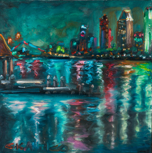
As an oil painter, Concetta paints each piece of art in one sitting and may accomplish 12 or more paintings per month. (With an exhibit on the horizon she has been known to paint up to 30 pieces in that time.) As it may seem, there is no time for creative blocks in Concetta’s world, although, she rarely feels confined by the age-old artist’s plague. Each day Concetta’s appreciation for art is renewed as she takes in the millions of shades, tones and hues that color her world.

Beyond her own art, Concetta also owns and operates an oil painting school called The Salon of Art (http://www.thesalonofart.com/). In her 25 years of teaching, she has instructed over 15,000 people on how to paint.

At a glance, it seems Concetta Antico has lived multiple lives, all dedicated to the pursuit of art. But these are merely chapters of a single story; the story of an artist. And the current chapter, the one where she and her art become known throughout the world, is only just beginning.

Behind the Artist’s Eyes

Concetta describes some of her recent fame as a result of being at the right place at the right time. And to some degree, this is true. In fact, had Concetta’s life not unfolded the way it has, the world may still not fully understand tetrachromacy, a condition where a person possesses four types of cone cells (independent channels for conveying colors) in the eye. It is typical to possess three cone cells but not four. Ultimately, a person with tetrachromacy, or a tetrachromat, may see 99 million more colors than the average person.

Rainbow Gully, Mission Hills, SD 12×16 Hi resConcetta Antico is the world’s first tetrachromat artist, a combination that some researchers have dubbed “The Perfect Storm.” One reason why few people know about tetrachromacy is because not many people know they are seeing more colors than other people. Concetta, on the other hand, has been immersed in color her entire life. Therefore, she is a highly functioning tetrachromat who fully embraced her condition before she knew it was there. This is why Concetta is able to help researchers better understand 2-3 percent of the world’s population that have four color cones. Tetrachromacy involves a unique connection between one’s eyes and brain. Sometimes, people who are unaware they are tetrachromat’s have not allowed their brains to recognize the large amount of colors their eyes take in. Because Concetta has been using color her entire life, her brain is quick to recognize assortments of color that others (even fellow tectrachromats) cannot process.

However, if it weren’t for being at the right place at the right time Concetta may not have learned she has tetrachromacy. Nor would the world have the first artist who can shed light on what it is like to see life through rich color.

Recognizing Tetrachromacy

Two separate occasions led Concetta to the team of researchers who would genotype her as a tetrachromat. The first was a trip to an optometrist with her daughter, and the second came in the form of an email from one of her students.

Peacock Tango! 40x60 Hi ResIn 2009, Concetta’s then 8-year-old daughter came home from school with an uncommon concern. She couldn’t see the board when her teacher wrote on it in orange. It seemed like a case of colorblindness, which is odd because it is very rare for girls to be colorblind. However, a trip to the eye doctor proved that Concetta, a lifelong lover of color, had a daughter with colorblindness.

Concetta didn’t think too much of the rarity in her line of DNA until a student of hers, Wendy Martin, sent her an email about a genetic factor that may influence how some individuals see color. Wendy was a research scientist herself and had noted an “alchemy” in Concetta’s work. When Wendy told the artist/teacher that she couldn’t put her finger on what made the art unique, Concetta joked that it must be her fourth receptor. Shortly after this conversation, Wendy sent Concetta an email with an article that connected the dots of her unique talent. The article stated that a person with four receptors could, in fact, have a colorblind daughter.

On this day in November, 2012, Concetta emailed the authors of the article, thus taking the first step in recognizing what the world knows her for today. Concetta Antico is a tetrachromat.

Same Art, New Fame

What has changed since receiving this news? Concetta still wakes up inspired by colors outside her windows and inside her home; she still owns and teaches at The Salon of Art; she completes each painting in one sitting. But on top of these decades-long practices, Concetta now has a press career. With the eloquence of a tenure educator, the accent of an Australian empress, and the poise of an internationally renowned artist, Concetta grants interviews about her artwork and how tetrachromacy influences her craft.

There is no doubt that Concetta’s talent and work ethic are worthy of fame, but much of this new wave of success has come from her accepting and embracing a DNA condition that is propelling her career to new heights.

Idyll Hours ~ Daisy Days 24×36 Hi ResSo in an exclusive interview with Concetta Antico, the world’s first tetrachromat artist, Segmation has one burning question: What is your favorite color?

Her response might come as a surprise. “White,” she says.

An artist who is known to live in a world of color is most drawn to the color white. Some might argue that white is not a color, but those people are not tetrachromats. “Everything speaks to me,” explains Concetta. “It’s hard to detach from color. It is a huge component of everything I do.” She also expresses that colors like red and yellow are too strong. To her, white is peaceful. And let us not forget, to a tetrachromat, even white is a mosaic of color.

Images made available by Concetta Antico.

Vision Problems Guide Artists

By looking at his paintings, you probably never guessed that Edgar Degard could not see well. However, the French realist painter was believed to have a congenital retinal problem. Similarly, Mary Cassatt and Claude Monet both had cataracts, which explain why the artists had trouble differentiating color later in life. And sketch artist Charles Méryon never toyed with color because he was well aware of his color-blindness.

Several artists have suffered from eye problems that pose obstacles to their chosen career paths. However, many artists leveraged their disabilities, using them as tools to guide their distinct style and career.

For instance, Peter Milton was diagnosed with color-blindness in 1962. This occurred after he spent years painting, teaching art, and studying under the master of color, Josef Albers. Upon receiving his diagnosis, Milton abandoned color; instead, he committed himself to the creation of black and white masterpieces. The absence of color did not void other creative elements of his artwork, though. Milton produced intricate works of art that are best described as “visual puzzles in which past and present seem to merge.”

Milton found a way to work around his eye problems while other artists did not. It has been reported that one in 10 men has color-blindness. A professor of ophthalmology at Stanford University, Michael Marmor, recognizes the challenge artists face when diagnosed with vision troubles. He tells NPR that “most artists who found out they were colorblind just switched to printmaking or sculpture.”

Some artists worked through their eye problems to create the art they loved and were known for. Claude Monet was quoted as saying, “At first I tried to be stubborn. How many times … have I stayed for hours under the harshest sun sitting on my campstool, in the shade of my parasol, forcing myself to resume my interrupted task and recapture the freshness that had disappeared from my palette! Wasted efforts.”

Throughout history, several artists approached vision troubles differently. Some worked through them, others looked past them, and many worked around their eye problems. Milton, who is a shining example of how to work around color-blindness, attributes his artistic style to his disability. “… It helps to have a disability,” he told NPR, “because when you can do anything, which of all the things you can do are you gonna choose? So something has to help you make the choice.”

Some of the world’s most well-known artwork has been produced by artists with vision problems. The pieces may seem to use askew color options or be void of color entirely, but to us, these color choices make the artwork appear distinct. And who knows, perhaps an artist accepted his or her disability and set out to create art in this authentic way.

Read more Segmation blog posts about art and color:

EnChroma Introduces Colorblind People to Color

The Gift of Color Vision

The Importance of Color Vision and Art

Be an Artist in 2 minutes with Segmation SegPlay® PC (see more details here)

Segmation

Join us on FacebookSegPlay® Mobile iTunes now available for iPhone and iPad

www.segmation.com

Properly Defining Color: Webster’s Dictionary and the Science of Color

Color is one of the hardest things to properly define. Most people do it by using comparatives such as “sunset orange,” “sky blue,” and “jade green”. But Webster’s Dictionary, wanting to be as direct and precise as possible, actually hired a color scientist to assist with color definitions for its Second Edition.

Isaac H. Godlove, who was chief color consultant for Webster’s from 1921 until 1935, had excellent credentials for the job. He was the chairman of the Committee of Measurement and Specification of the Inter-Society Color Council, a member of the Colorimetry Committee of the Optical Society, and director of the Munsell Research Laboratory, which created the Munsell Color Company, formed specifically to standardize colors.

Dr. Godlove created a system of defining colors by hue, saturation, and brilliance. Hue was the color itself, such as red or yellow; saturation described how the color looked under certain lighting conditions; brilliance (also known as brightness) was measured by how close it was to white. He defined ‘cherry’ as “a bright-red color; a color, yellowish-red in hue, of very high saturation and medium brilliance.” The entry for color is three columns long and includes graphs and two color plates.

Pleased with and even awed by his work, Webster’s editors called Godlove in to work on color definitions for the Third Edition. In the intervening years between the two editions, color names had become increasingly standardized. Popular use of these names had even been analyzed in mass-marketing campaigns, and their findings were to be incorporated into the new edition.

The Third Edition contained comprehensive color plates as well as an entire page dedicated to explaining the color charts and the descriptive names of each hue. There was even a five-page dye chart! Other additions and changes included:

  • Color definitions were now relational: each one was now something “more or less of” another. There were no more formulaic descriptions of a color’s hue, saturation, and brilliance.
  • Color names were defined by so-called ‘color specialists’ from retail giants Sears Roebuck and Montgomery Ward. This resulted in consumer-style definitions such as ‘Cerise’: a moderate red that is slightly darker than claret (sense 3a), slightly lighter than Harvard crimson (sense 1), very slightly bluer and duller than average strawberry (sense 2a), and bluer and very slightly lighter than Turkey red.

In retrospect, the Third Edition took the ‘color as science’ concept too far. These definitions are too full-blown and subjective to make sense to the average person, except for ‘light blue’, ‘pale green’, or, in the cerise example ‘moderate red’. Accordingly, they were demystified and translated into simpler language in future editions: today, Webster’s defines the color blue as ‘the color of the sky’.

When Webster’s original 1847 edition was being revised during the 1850s, colors were more simply defined. Red was blood. Green was fresh grass. Those are descriptions we can easily relate to today, over 150 years later.

Science is an amazing and liberating field, but when it comes to describing the raw beauty of color, it seems simplicity is all we need.

Read more Segmation blog posts about art and color:

Color Advances Science

Art Illuminates Science

The Psychology of Color

Be an Artist in 2 minutes with Segmation SegPlay® PC (see more details here)

Segmation

Join us on FacebookSegPlay® Mobile iTunes now available for iPhone and iPad

www.segmation.com

Fun Facts About Familiar Colors

Color. It defines our reality, evokes emotion, can affect our choices, and makes a difference in the way we look. All of us are familiar with the primary colors, but this post reveals some little-known facts that may surprise you.

Red:

Red is usually associated with power and passion. It is vibrant, daring, and attracts attention. For instance, think about the responses drawn by red cars and crimson lipstick.

Fun facts about red:

  • Although it’s widely believed that red capes make bulls angry, the reality is that bulls are colorblind. In this instance, the red lining is meant to conceal any bloodstains.
  • Seeing a red object can make your heart beat faster.
  • In China, brides wear red wedding dresses for good luck.
  • There are approximately 23 different shades of red crayons.

Orange:

The artist Wassily Kandinsky once said, “Orange is red brought nearer to humanity by yellow.” It’s one of those colors people love or hate. Vibrant and engaging, it is the only color of the spectrum that gets its name from an object- in this case the orange fruit.

Fun facts about orange:

  • In France, the middle traffic light is orange.
  • In Hindu tradition, orange is an auspicious and sacred color.
  • Orange is both the name and emblematic color of the British royal family.
  • The ‘black boxes’ on aircraft are really bright orange so they can be located more easily.

Yellow:

German writer and statesman Johann von Goethe said in 1840, “With yellow the eye rejoices, the heart expands, the spirit is cheered and we immediately feel warmed.’ The same holds true today: yellow is associated with optimism and enlightenment.

Fun facts about yellow:

  • Although yellow is considered a peaceful color, people lose their tempers more frequently in yellow rooms.
  • Legal pads are yellow because it improves concentration ability.
  • 75% of the pencils sold in the U.S. are yellow.
  • A yellow flag indicates a medical quarantine.

Green:

Green is not just a color anymore; it is a symbol of environmentally friendly products, buildings, and lifestyles. Green has represented growth, regeneration, and fertility since the beginning of time.

Fun facts about green:

  • People waiting to appear on TV wait in ‘green rooms’ because the color can soothe a bad case of the nerves.
  • Hospital decor is usually green because it calms patients.
  • Seamstresses won’t use green thread before a fashion show, fearing it can cause bad luck.
  • Brides in the Middle Ages wore green to represent fertility.

Blue:

Blue is one of the most popular colors. It causes the human body to produce calming chemicals, which is why it’s often used in bedrooms. Blue is also gender-neutral, appealing to both men and women equally.

Fun facts about blue:

  • Fashion consultants recommend wearing blue to job interviews because it represents loyalty.
  • Weightlifters can lift heavier weights in blue-walled gyms.
  • Workers are more productive in blue rooms.
  • Blue plates make food appear less appealing: a note to dieters!

Indigo:

We have Isaac Newton to thank for adding indigo to the color spectrum. He wanted the number of colors to match the seven-tone musical scale of Rene Descartes, so indigo was chosen to bring the color spectrum count to seven.

Fun facts about blue:

  • Black light turns ripe bananas a bright indigo color.
  • During the Elizabethan era, only royalty, nobility, and members of the Council could legally wear indigo.
  • Indigo is often called ‘royal’ blue.
  • The Virgin Mary is frequently depicted wearing indigo clothing.

Purple:

Because it appears so rarely in nature and is expensive to create, purple has a powerful history that has evolved with the centuries. It is the most powerful wavelength of the rainbow and denotes wealth and sophistication.

Fun facts about purple:

  • The Romans used to extract an essence for making purple by boiling thousands of marine snails.
  • In some cultures, purple is the color of mourning.
  • Only two of the world’s flags contain purple.
  • In Italy, performers refuse to go on stage wearing purple.

Read more Segmation blog posts about art and color:

Colorful Jewelry Inspired by Classic Art

Red Artwork is Worth Fortunes

The Reason Why Barns Are Red

Be an Artist in 2 minutes with Segmation SegPlay® PC (see more details here)

Segmation

Join us on FacebookSegPlay® Mobile iTunes now available for iPhone and iPad

www.segmation.com


The Writer Who Knows Her Colors

Who needs Pantone when you can create your own colors? A multi-talented artist from Los Angeles recently created a color chart that helps her write better.

Ingrid Sundberg knows color. You might find this statement ironic when presented with a picture of Ingrid. Her hair is currently purple. But an out-of-the-box hair color is only the tip of the iceberg. Ingrid Sundberg really knows her colors and she is sharing her knowledge with the world through a color thesaurus.

Arranging and naming 240 unique colors, Ingrid compiled a seemingly comprehensive thesaurus. However, her purpose in completing this strategic art activity was not to publish a reference manual. Her goal has always been to boost her creative writing. With this lexicon of colors before her, she can create descriptive and intriguing work. “I use it all the time when I write. It really helps in revision as I try to make my work fresh and vibrant,” says Ingrid.

Other writers benefit from this thesaurus, too. Those who read and follow Ingrid’s blog, “Ingrid’s notes,” may have known about the color guide. However, Ingrid wants everyone to know it is not official. “This was something I made for myself based on color words I liked and the colors the words evoked for me…” she tells Board Panda. This explains how inventive colors like bumblebee, tiger and penny made the list.

Now that multiple media sources have reported on the color thesaurus, some haters are emerging, claiming the various shades of black are too similar and pointing out how Pantone already created a comprehensive color chart. Unfortunately, these people overlook what motivated Ingrid to create such a chart in the first place. She was never trying to cut corners or appease the world around her; she wanted to create a tool to help her write descriptive and intriguing passages.

Such a color chart does more than enhance her writing; it may add to her visual artwork as well. That’s right—Ingrid publishes novels for young adult readers and illustrates children’s books, too.

Ingrid credits her broad range of artistic talents to a childhood where, living in Maine, she cultivated a vivid imagination. On her journey from being an engaged child to a lifelong learner, Ingrid received a bachelor’s degree in illustration and a master’s degree in screenwriting.

While we do not know if the color thesaurus helps Ingrid bake better (because yes – she bakes too: http://www.ingridcakes.blogspot.com/), she likes its assistance so much that she is making additional color charts: a hair color chart and “emotions/facial expressions thesaurus” are in the works.

It seems that Ingrid has accomplished what she intended. Better yet, she has proven to be a talented creative writer: her first book, All We Left Behind, will be published in 2015.

Read more Segmation blog posts about art

Pantone’s World of Color

Technology to Permanently Change Your Hair Color

Art on Color is No Joke

Be an Artist in 2 minutes with Segmation SegPlay® PC (see more details here)

Segmation

Join us on FacebookSegPlay® Mobile iTunes now available for iPhone and iPad

www.segmation.com